1. Buttons & Badges
2. Alerts
3. Callout
4. Cards (Advanced Demos)
A. Minimalist Info Card
A simple card used for text-heavy content. Notice the clean borders and standard spacing.
B. Card with Action Footer
This card includes a footer action to demonstrate how buttons align within the card context.
C. Feature/Icon Card
⚡
This card layout is perfect for showcasing feature sets or service offerings.
D. Media-Rich Card
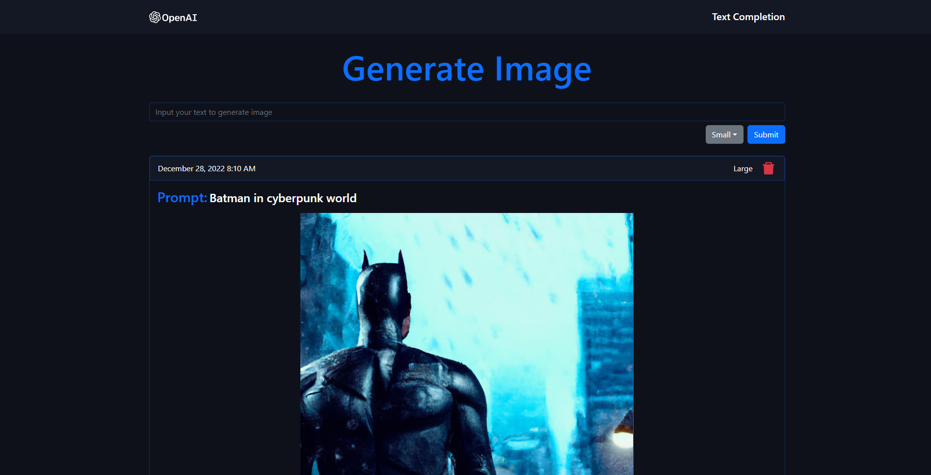
This card tests the integration of the AspectRatio component and Image component within a card container.
E. Multi-Column Card Layout
5. Table (Advanced Layouts)
A. Alignment and Formatting
B. Table with Content Formatting
C. Table with Long Text (Stress Test)
title Testing Batch 2
1. Accordion
2. Tabs
This is the content for the overview tab.
3. Steps
Setup ProjectInstall dependencies using pnpm install.
Install dependencies using pnpm install.
Configure RegistryRun pnpm build:registry to generate the component index.
Run pnpm build:registry to generate the component index.
DeployPush your changes to Vercel and verify the build.
Push your changes to Vercel and verify the build.
4. Aspect Ratio & Image
A. Landscape (16/9) - Standard
B. Portrait (3/4)
C. Square (1/1)
D. Responsive Container Test
title Testing Batch 3
1. Checkbox
2. Keyboard Shortcuts (Kbd)
Press ⌘ + K to open the command menu. You can also use CtrlS to save.
3. Linked Cards
4. Code Blocks (Tabs & Collapsible)
A. Code Tabs
npx shadcn@latest add button
B. Collapsible Code Wrapper
B. Collapsible Code Wrapper
function ComplexComponent() { return ( <div className="p-4"> <p>This code block is hidden by default.</p> <p>Click expand to reveal the rest of this long logic.</p> <p>Click expand to reveal the rest of this long logic.</p> <p>Click expand to reveal the rest of this long logic.</p> <p>This code block is hidden by default.</p> <p>Click expand to reveal the rest of this long logic.</p> <p>Click expand to reveal the rest of this long logic.</p> <p>Click expand to reveal the rest of this long logic.</p> </div> ) }
Batch 4
1. Component Preview
This component renders the my-button-demo from your registry.
3. Components List
A grid layout for showcasing multiple components at once.
4. Block Preview (The Helix Sidebar)
This tests the full-blown block viewer which requires the registry and shiki highlight to work correctly.
5. Image Component Tests
A. Explicitly Sized Image
Use this when you know the fixed dimensions of your image.
B. Responsive Fill (via AspectRatio)
Use this when you want the image to fill its container while maintaining a specific aspect ratio. (No width/height needed here, the component handles the "fill" logic for you)
C. Portrait Fill (3/4 Ratio)
D. Standard Markdown Image (Native)
This tests if your img mapping in mdx-components.tsx is working for standard Markdown syntax.
npx shadcn@latest add button